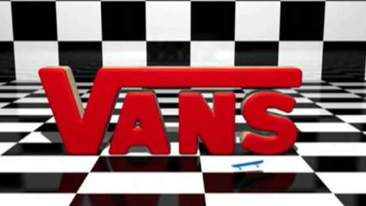
The Vans logo is a familiar sight to many of us—a simple design featuring the word ‘VANS’ with a line extending across the top of the other letters.


However, once you make the connection between the logo and mathematics, it becomes an intriguing and mind-blowing revelation that is hard to ignore.
This unexpected realization has taken the internet by storm, leaving hundreds of users astonished and forever changing the way they perceive this popular shoe brand. While the logo may appear to be a mere arrangement of letters at first glance, its resemblance to a mathematical symbol has sparked a new level of fascination among fans.
The Vans Logo and Its Connection to Math:
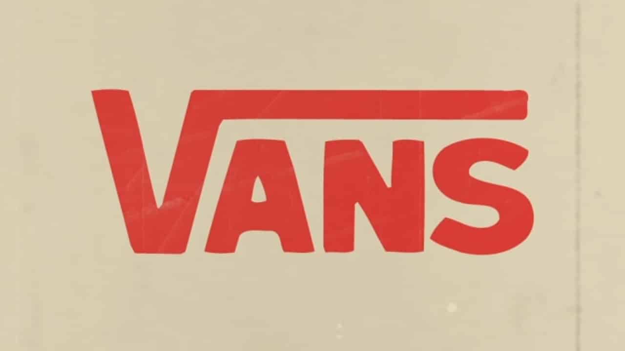
TikTok users were among the first to uncover the intriguing link between the Vans logo and mathematics. They noticed that the ‘V’ in the logo bears a striking resemblance to the ‘square root’ symbol, commonly known as a ‘Radical’ in mathematical terms.
Armed with calculators, internet users demonstrated that the logo for Vans is equivalent to the mathematical equation for ‘the square root of answer,’ which is symbolized as ‘√ANS’ on a calculator.

This realization spread rapidly across social media platforms, prompting numerous reactions from astonished individuals who couldn’t help but exclaim, “once you see it, you can’t unsee it!”
Twitter and Reddit were abuzz with amazed responses to the revelation. One Twitter user expressed their astonishment with a simple yet powerful statement, while another responded with a resounding “Noooooooooooooo.”
On Reddit, a creative individual even envisioned a humorous scenario involving a customer and a Vans store employee. In this imaginary scenario, a person walks into a Vans store and is asked about their favorite type of shoe.
The customer enthusiastically replies, “Vans!” The employee then responds, “Radical Answer, bro,” cleverly incorporating the math equation into their conversation. These reactions reflect the impact that this newfound connection between the Vans logo and mathematics has had on people’s perception of the brand.
The Unintentional Link
Despite the compelling resemblance between the Vans logo and the square root symbol, it appears that the connection to mathematics was unintentional. According to the Logo My Way blog, the original version of the logo was actually designed by the son of one of the brand’s founders.


Initially intended for a skateboard, the graphic caught the attention of James Van Doren, who decided to incorporate it into the heel of the company’s shoe designs. This marked the beginning of Vans’ successful foray into large-scale manufacturing of skateboarding footwear.
The elongated line extending over the final three letters became an integral part of the company’s visual brand identity, enabling customers to easily recognize and associate it with Vans.
While the Vans logo’s resemblance to a mathematical symbol has left many people mind-blown and unable to unsee the connection, it is important to note that this link was unintentional.
The logo’s origin can be traced back to the company’s early days, when a graphic designed for a skateboard found its way onto their shoes. Nevertheless, this revelation has added an intriguing layer to the perception of the Vans brand, demonstrating how a seemingly simple logo can captivate the imaginations of countless individuals.
Ultimately, it is a relief for many that their footwear does not feel like a school lesson, allowing them to appreciate the Vans logo, its connection to math, and its history in a new light.